PUBLISHED ON 8TH JULY
PUBLISHED ON 8TH JULY
9 MIN READ
9 MIN READ
Boosting Depositor Conversion: How We Achieved an 8% Lift
Boosting Depositor Conversion: How We Achieved an 8% Lift


The biggest challenge for real money gaming (RMG) platforms is getting users to make their first deposit, especially in India, where people are cautious about spending money.
The biggest challenge for real money gaming (RMG) platforms is getting users to make their first deposit, especially in India, where people are cautious about spending money.
The biggest challenge for real money gaming (RMG) platforms is getting users to make their first deposit, especially in India, where people are cautious about spending money.
Our current Day 0 (D0) depositor conversion stands at 20%, meaning only 20 out of 100 new users deposit money on their first day. Week 0 (W0) conversion is at 23%, indicating that if a user doesn’t deposit within the first 2–3 days, they are unlikely to do so later.
Our current Day 0 (D0) depositor conversion stands at 20%, meaning only 20 out of 100 new users deposit money on their first day. Week 0 (W0) conversion is at 23%, indicating that if a user doesn’t deposit within the first 2–3 days, they are unlikely to do so later.
Our current Day 0 (D0) depositor conversion stands at 20%, meaning only 20 out of 100 new users deposit money on their first day. Week 0 (W0) conversion is at 23%, indicating that if a user doesn’t deposit within the first 2–3 days, they are unlikely to do so later.
My role was to improve communication across touch points where users interacted with the wallet. and by the end of the project, our D0 conversion rate in India increased by 8%. We also scaled this improvement to the US, where the conversion rate rose from 10% to 14%.
My role was to improve communication across touch points where users interacted with the wallet. and by the end of the project, our D0 conversion rate in India increased by 8%. We also scaled this improvement to the US, where the conversion rate rose from 10% to 14%.
My role was to improve communication across touch points where users interacted with the wallet. and by the end of the project, our D0 conversion rate in India increased by 8%. We also scaled this improvement to the US, where the conversion rate rose from 10% to 14%.

My first task was to identify all the touchpoints users interact with. Since this was my first project at MPL, I also took the initiative to fix a few other issues that could be confusing for new users.
My first task was to identify all the touchpoints users interact with. Since this was my first project at MPL, I also took the initiative to fix a few other issues that could be confusing for new users.

For a new user, we offer aggressive and high-value promotions on Day 0, but these are not highlighted across any of the major touchpoints mentioned above - which is a concern.
For a new user, we offer aggressive and high-value promotions on Day 0, but these are not highlighted across any of the major touchpoints mentioned above - which is a concern.

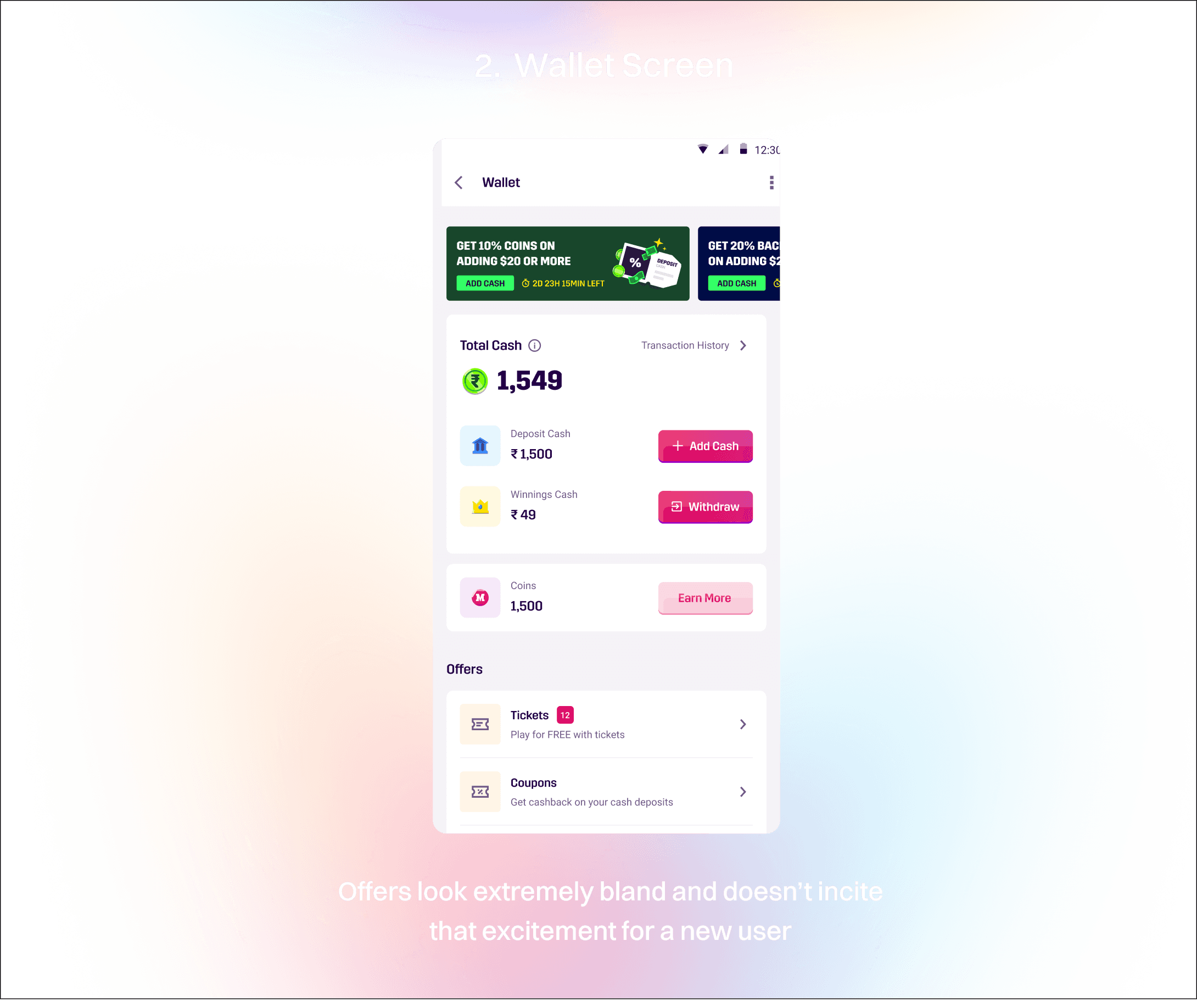
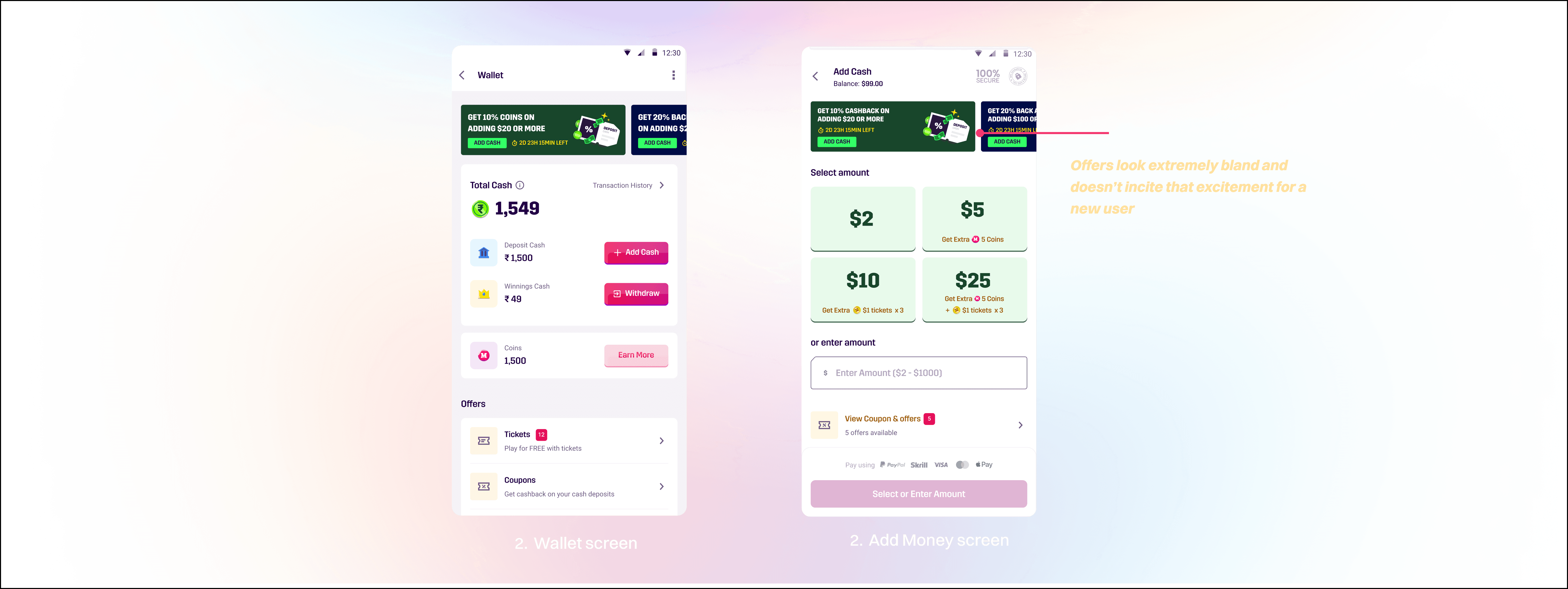
2) Wallet Page: The wallet page only shows billboard-style banners, which are outdated and easy for users to ignore.
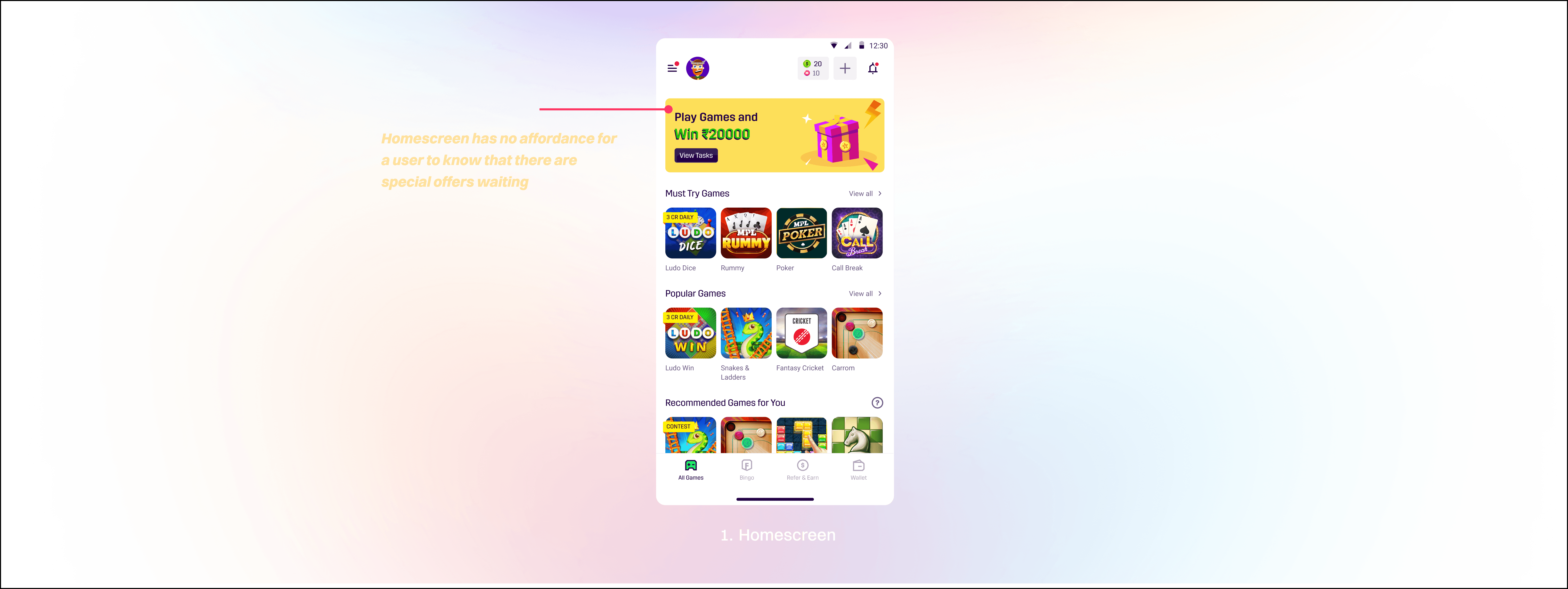
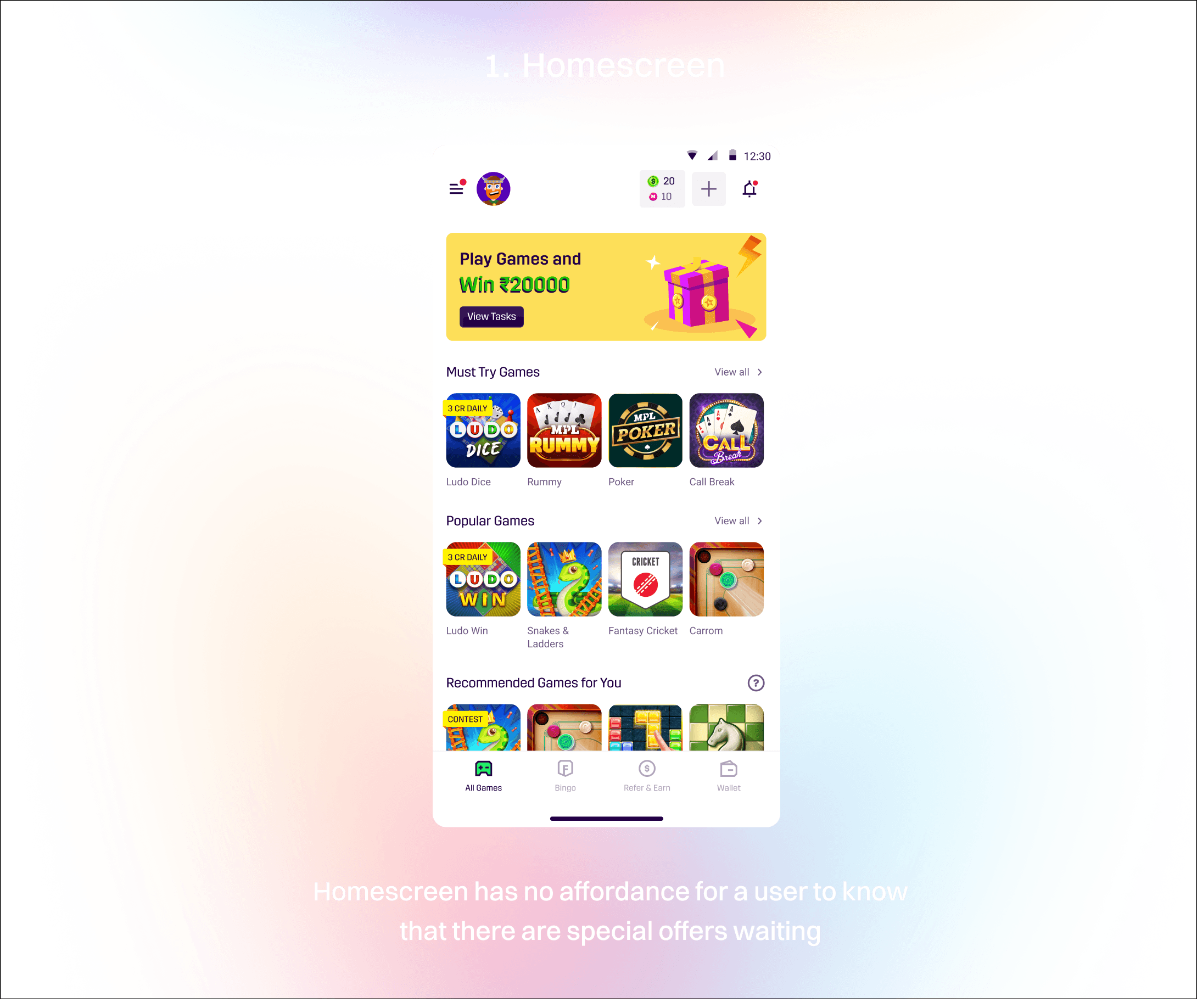
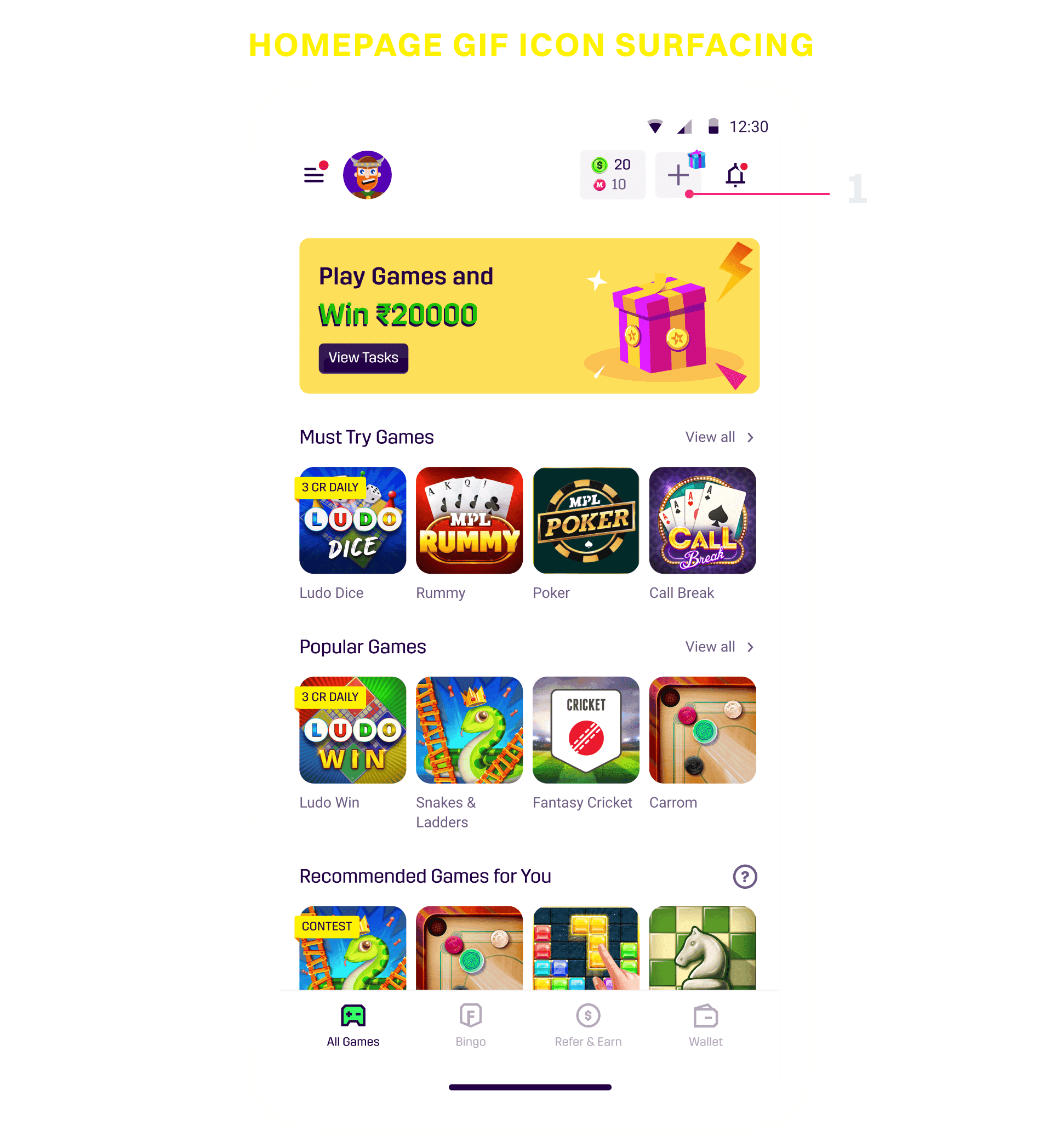
1) Home Screen: There’s no communication informing the user about the offer, nor is there any clear action for them to take.
3) Add Cash Page: The same issue persists here - the offer callouts are weak and fail to create any excitement for a new user.
1) Home Screen: There’s no communication informing the user about the offer, nor is there any clear action for them to take.
1) Home Screen: There’s no communication informing the user about the offer, nor is there any clear action for them to take.
2) Wallet Page: The wallet page only shows billboard-style banners, which are outdated and easy for users to ignore.
2) Wallet Page: The wallet page only shows billboard-style banners, which are outdated and easy for users to ignore.
3) Add Cash Page: The same issue persists here - the offer callouts are weak and fail to create any excitement for a new user.
3) Add Cash Page: The same issue persists here - the offer callouts are weak and fail to create any excitement for a new user.

To better understand this problem, I explored other RMG apps in India and discovered some unique ways they engage users and communicate attractive deals. I’ve shared a few screenshots below and highlighted the elements I found interesting.
To better understand this problem, I explored other RMG apps in India and discovered some unique ways they engage users and communicate attractive deals. I’ve shared a few screenshots below and highlighted the elements I found interesting.
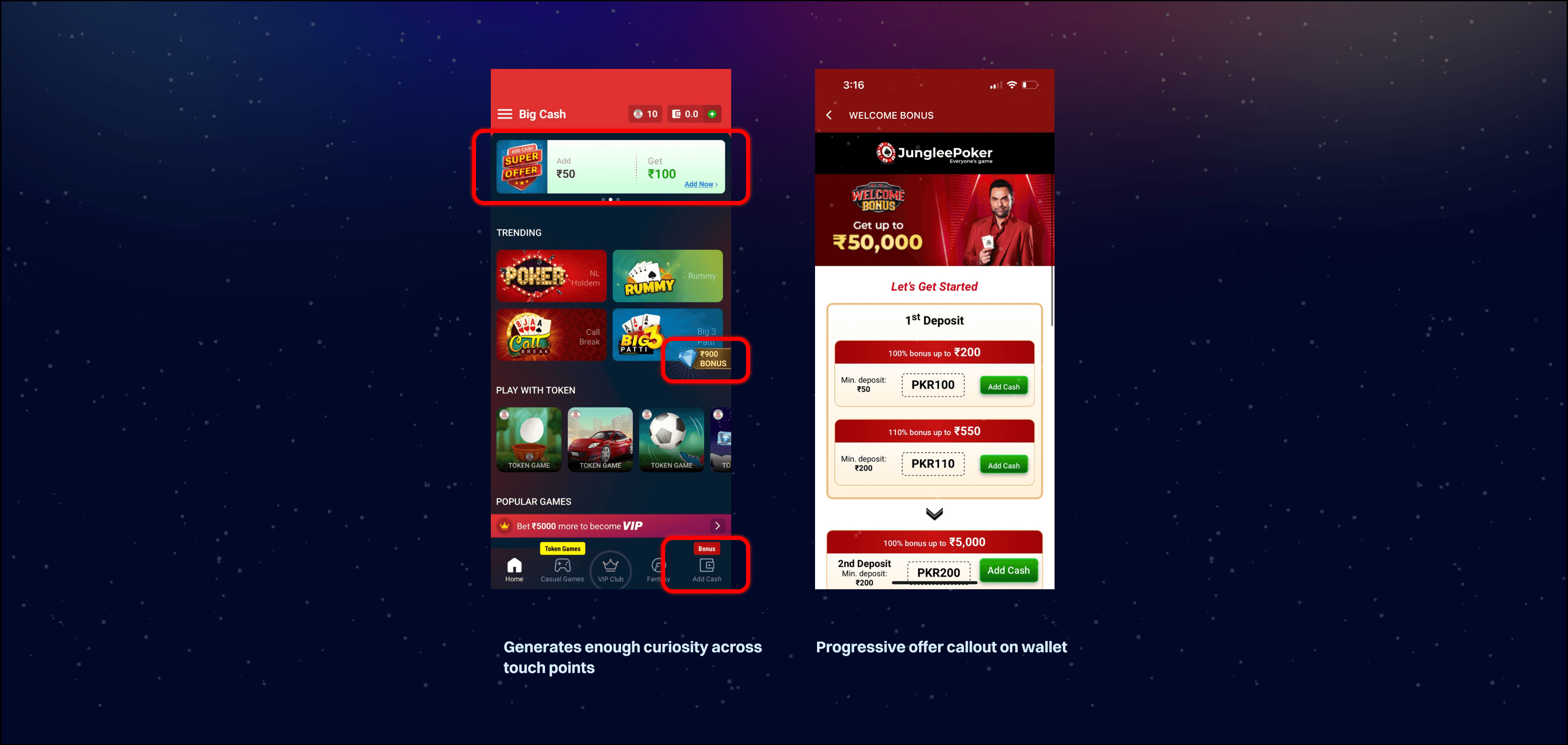
The above apps are top rmg gaming apps in India - Winzo, Rush, Junglee Games, Big Cash
The above apps are top rmg gaming apps in India - Winzo, Rush, Junglee Games, Big Cash
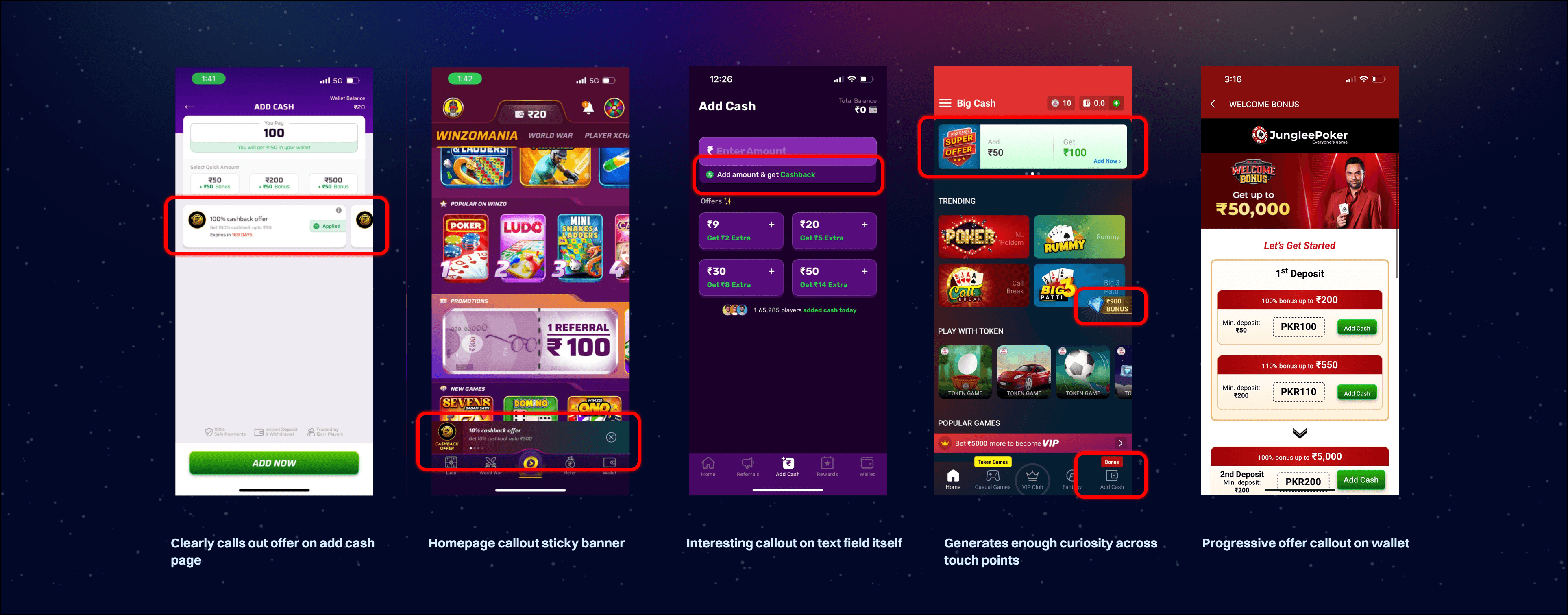
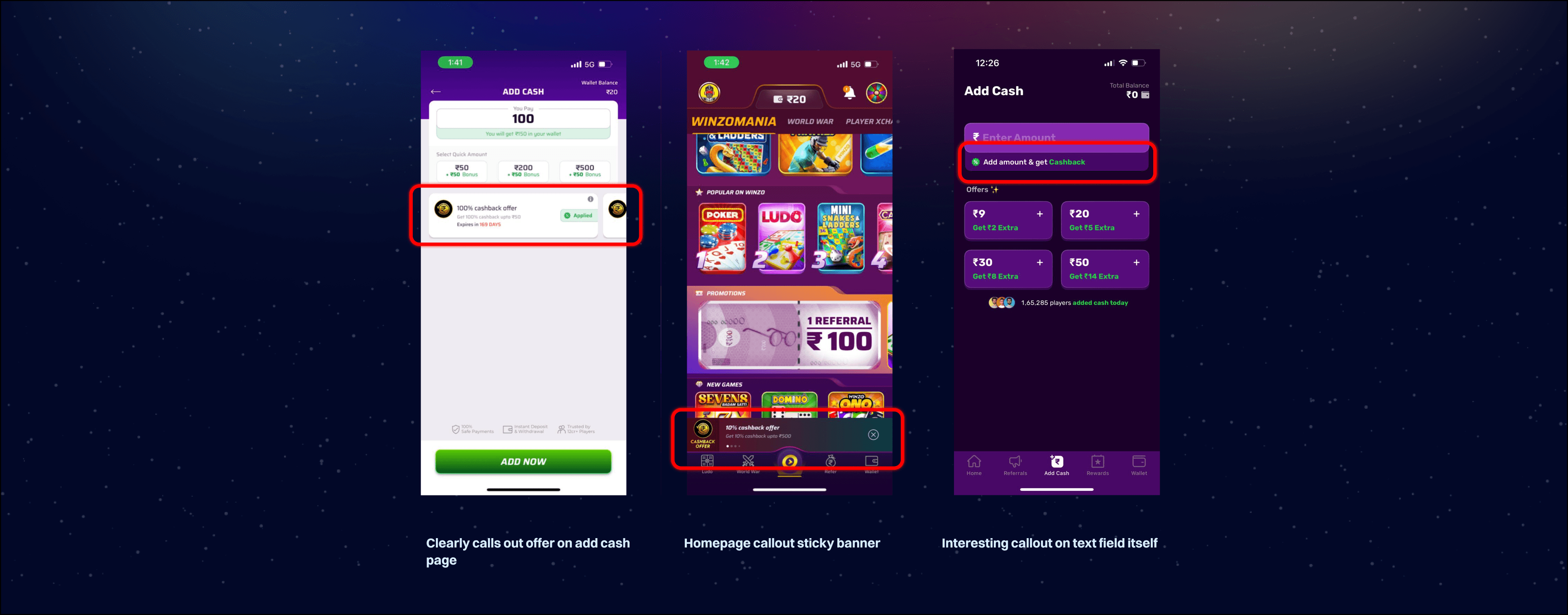

I found some really interesting ideas from these inspirations, trust me there were more but I added the main ones which actually hooked me as well to deposit
The above apps are top rmg gaming apps in India - Winzo, Rush, Junglee Games, Big Cash
I found some really interesting ideas from these inspirations, trust me there were more but I added the main ones which actually hooked me as well to deposit
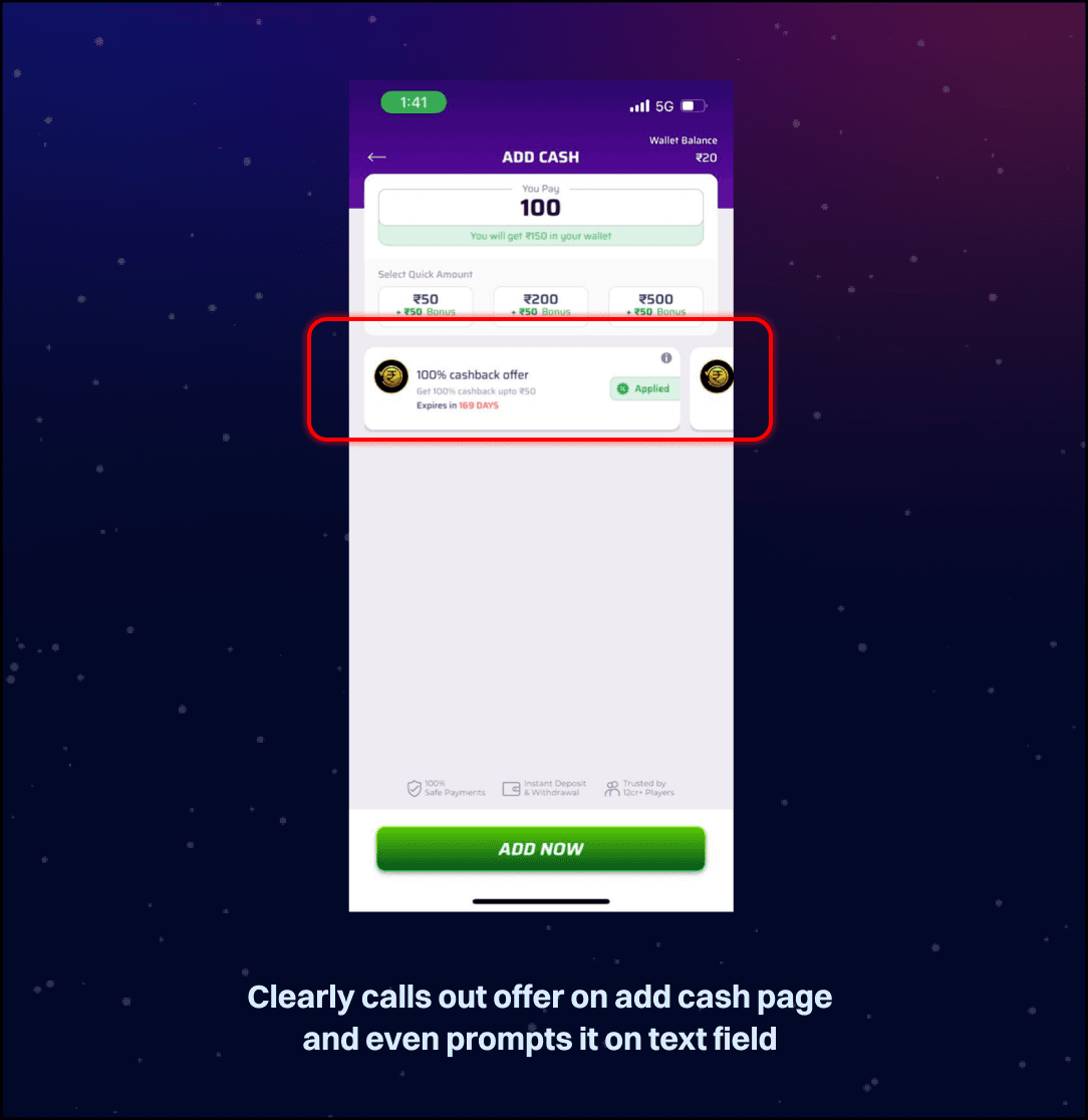
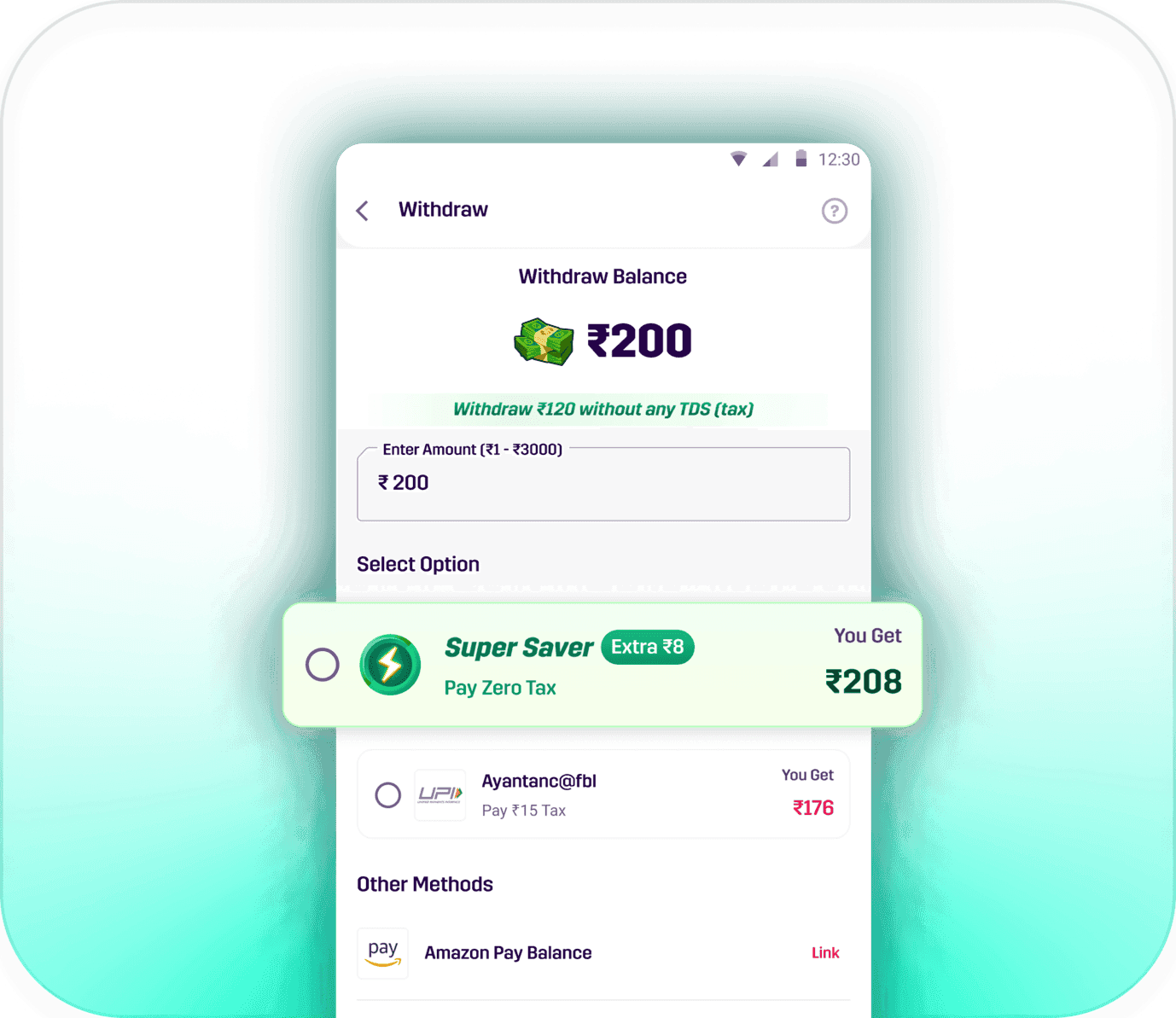
1) Showing how much a user will get post user entering an amount is an excellent way to communicate to users how much they get
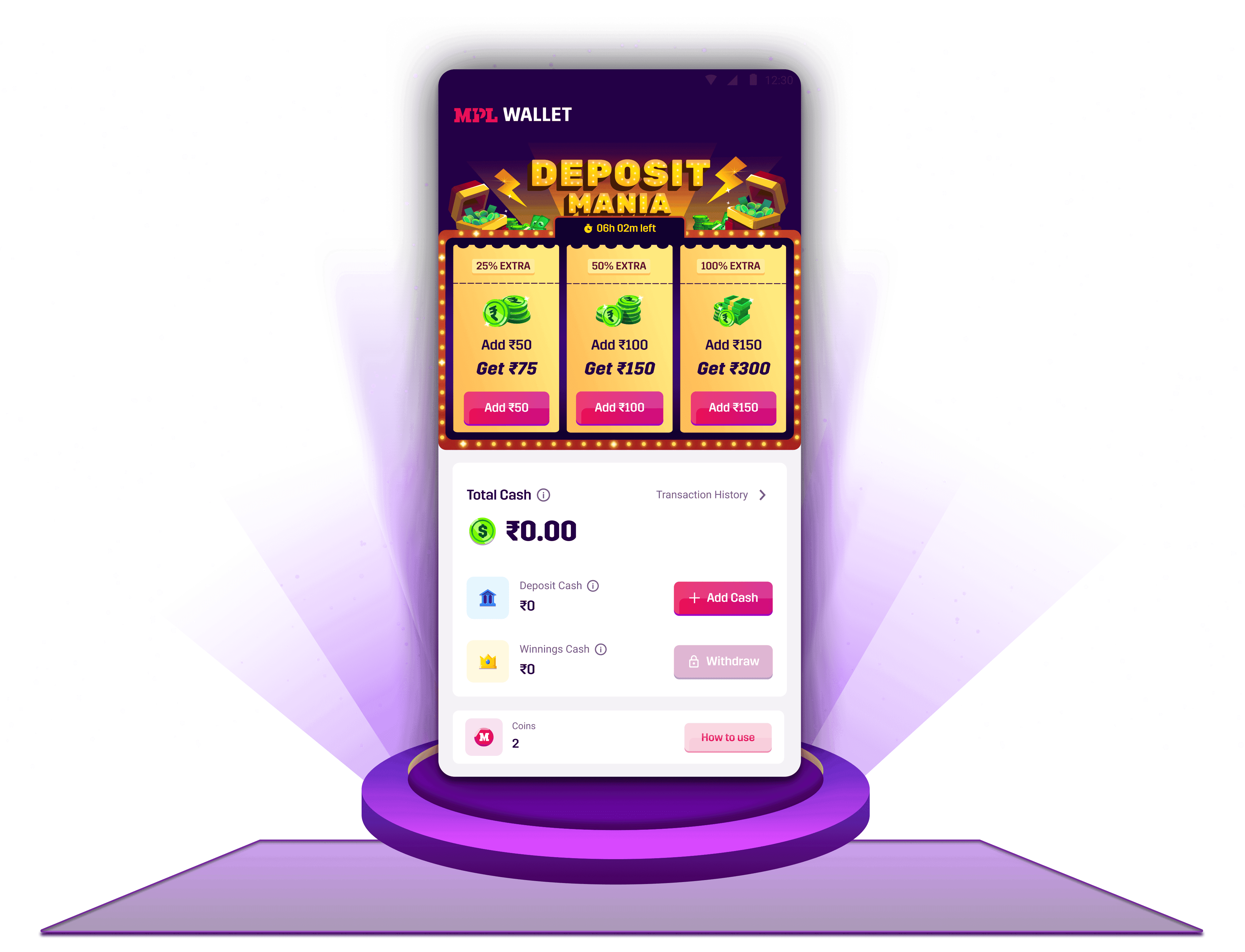
2) Any form of affordance on the home page indicating an offer is a good way to grab a user's attention is what i noticed
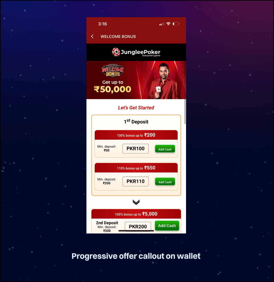
3) Progressive offers are also quite a hook since user knows exactly how much they get on the first 5 deposits which may push rentention
1) Showing how much a user will get post user entering an amount is an excellent way to communicate to users how much they get
Junglee Games : Really interesting way to push users for their first 5 deposits
2) Any form of affordance on the home page indicating an offer is a good way to grab a user's attention is what i noticed
2) Rush : I liked how they inform user before entering amount that they will receive cashback on it

4) Big Cash : Any form of affordance on the home page indicating an offer is a good way to grab a user's attention is what i noticed
3) Progressive offers are also quite a hook since user knows exactly how much they get on the first 5 deposits which may push rentention
3) Winzo : Showing how much a user will get post user entering an amount is an excellent way to communicate to users how much they get

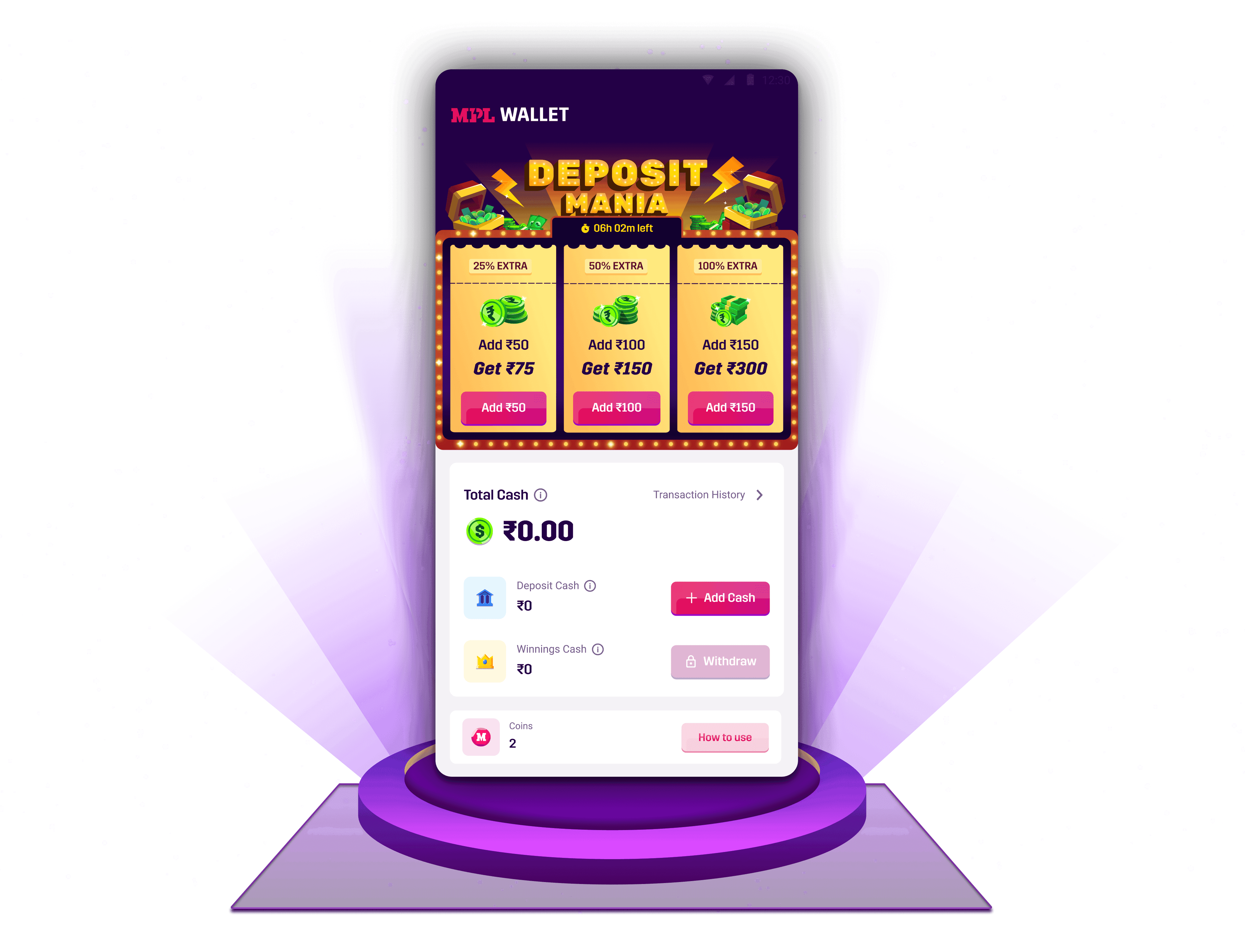
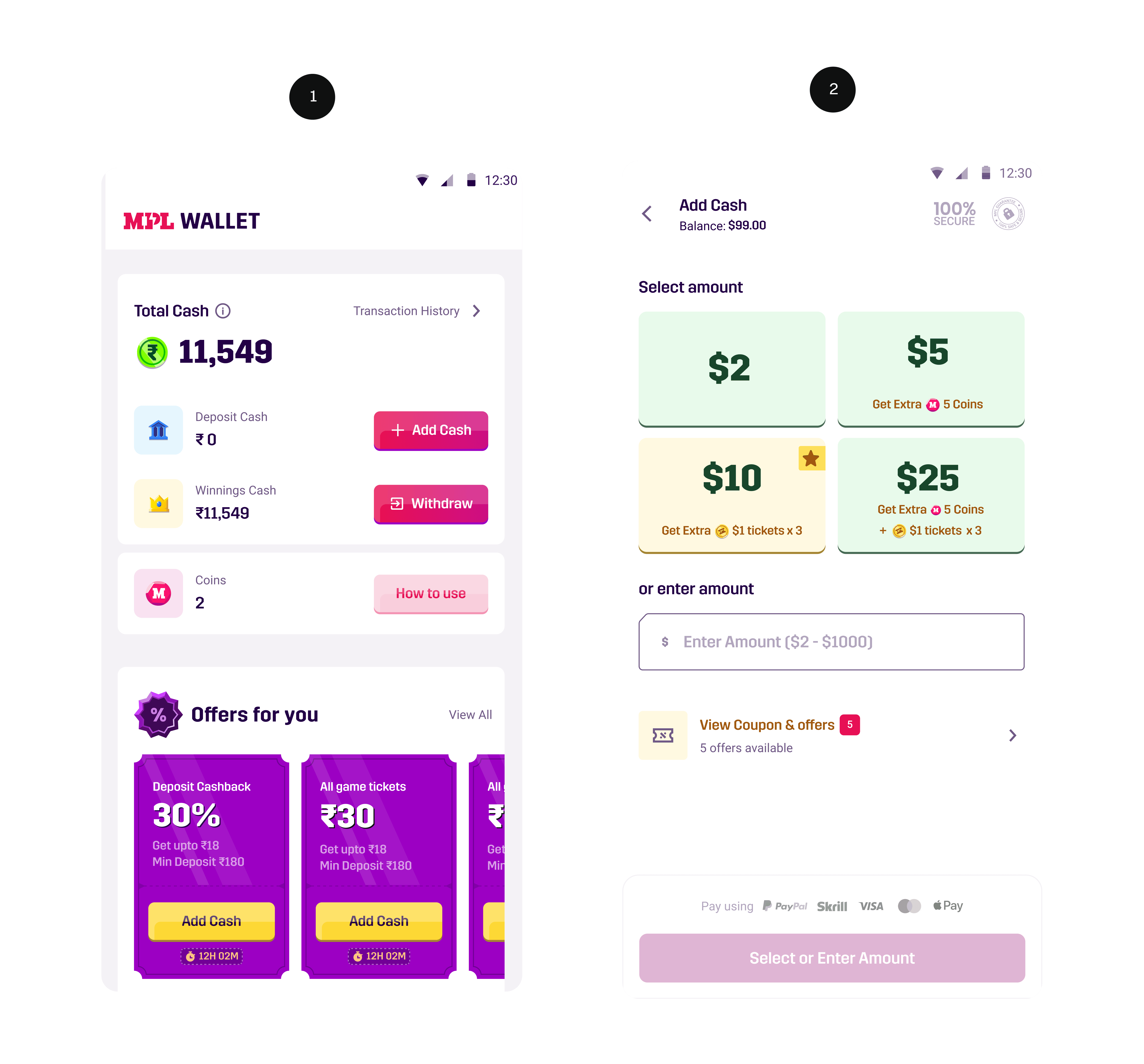
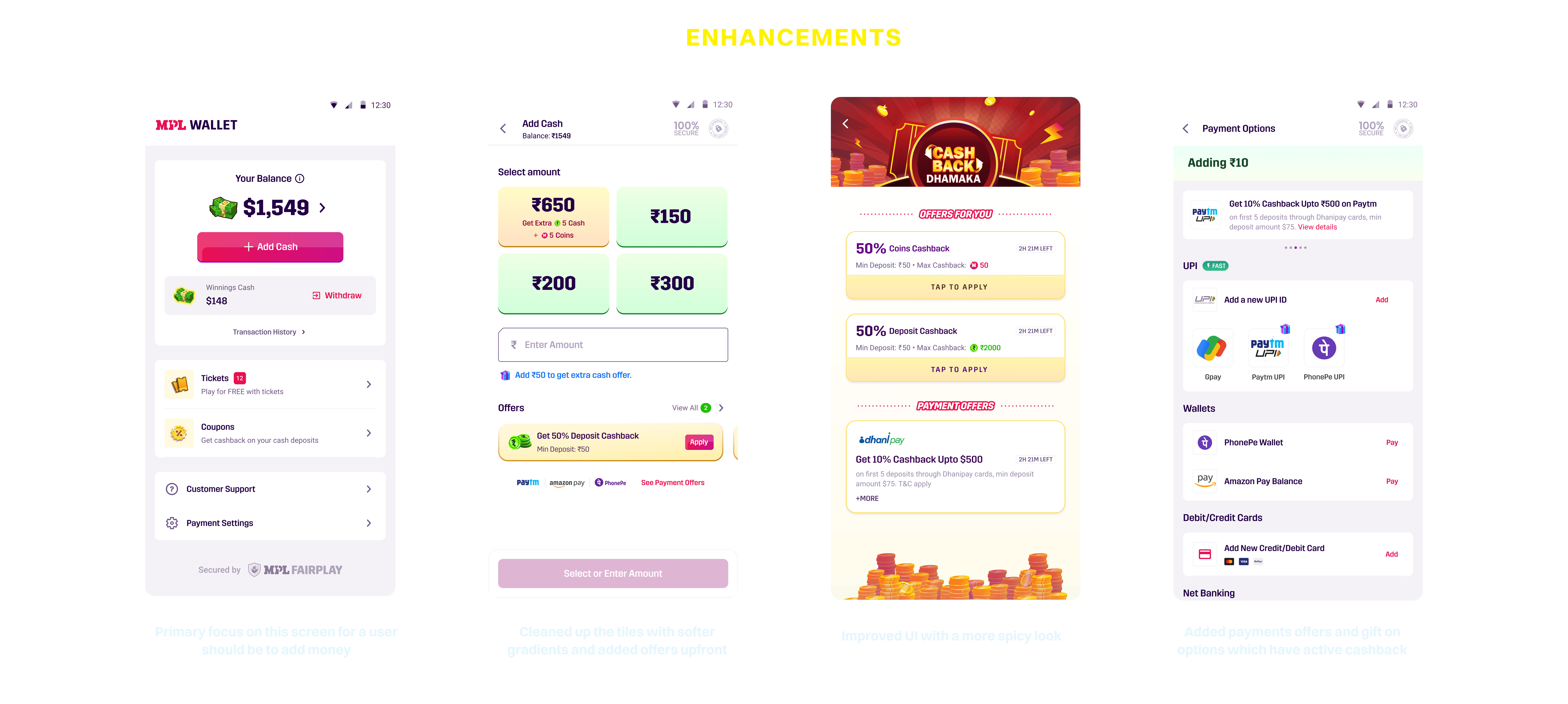
On the wallet screen, I designed a standout element that intentionally breaks away from the current UI to feel special and grab attention. This was important because the wallet is our biggest touchpoint - over 60% of users land here right after login.
On the wallet screen, I designed a standout element that intentionally breaks away from the current UI to feel special and grab attention. This was important because the wallet is our biggest touchpoint - over 60% of users land here right after login.
8% Increase in deposit conversion through this screen
8% Increase in deposit conversion through this screen
80% users in today’s date go through this flow to add money
80% users in today’s date go through this flow to add money


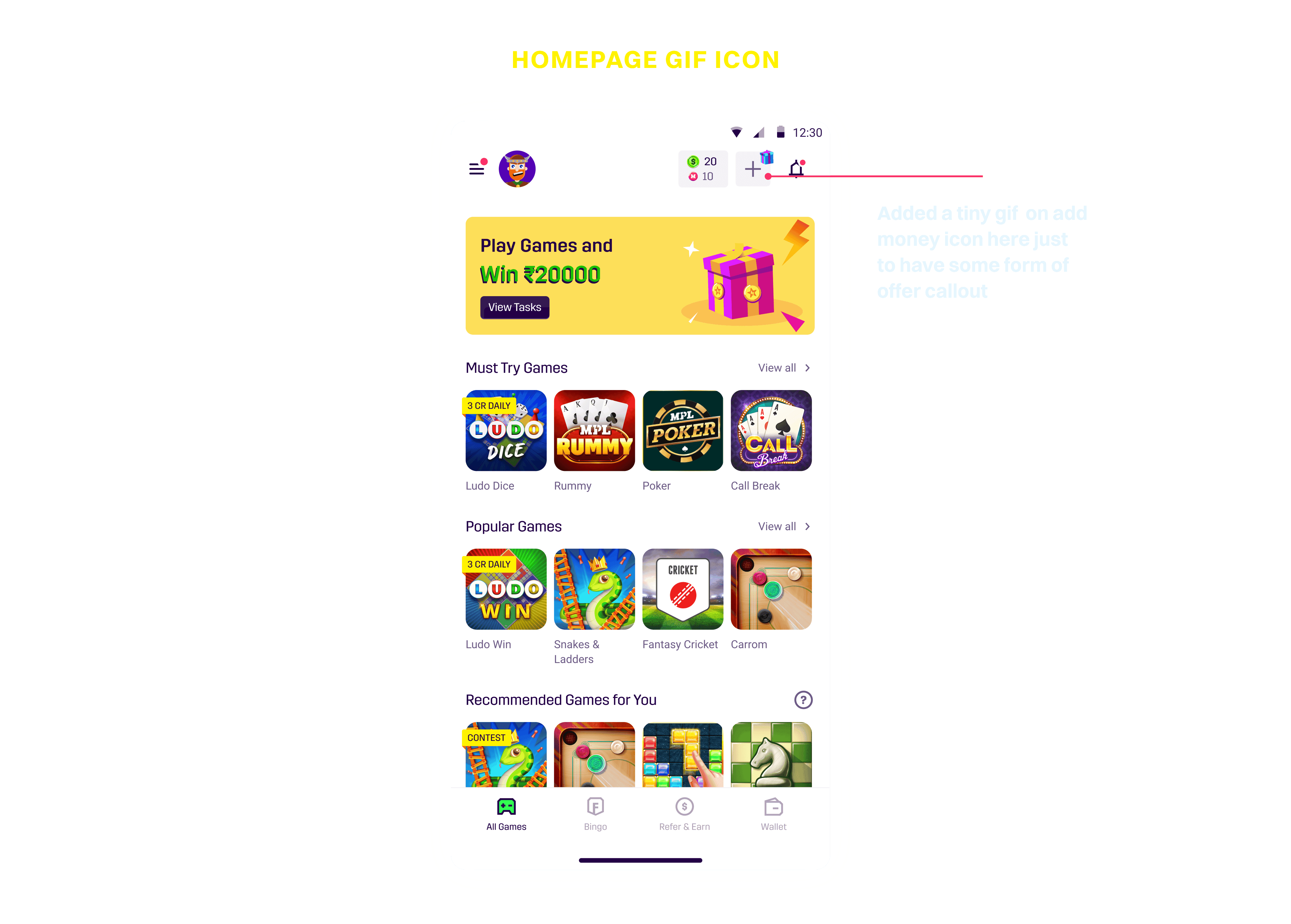
By adding a small gift box icon - Our click increased by 20% on homepage out of which 5% converted
By adding a small gift box icon - Our click increased by 20% on homepage out of which 5% converted
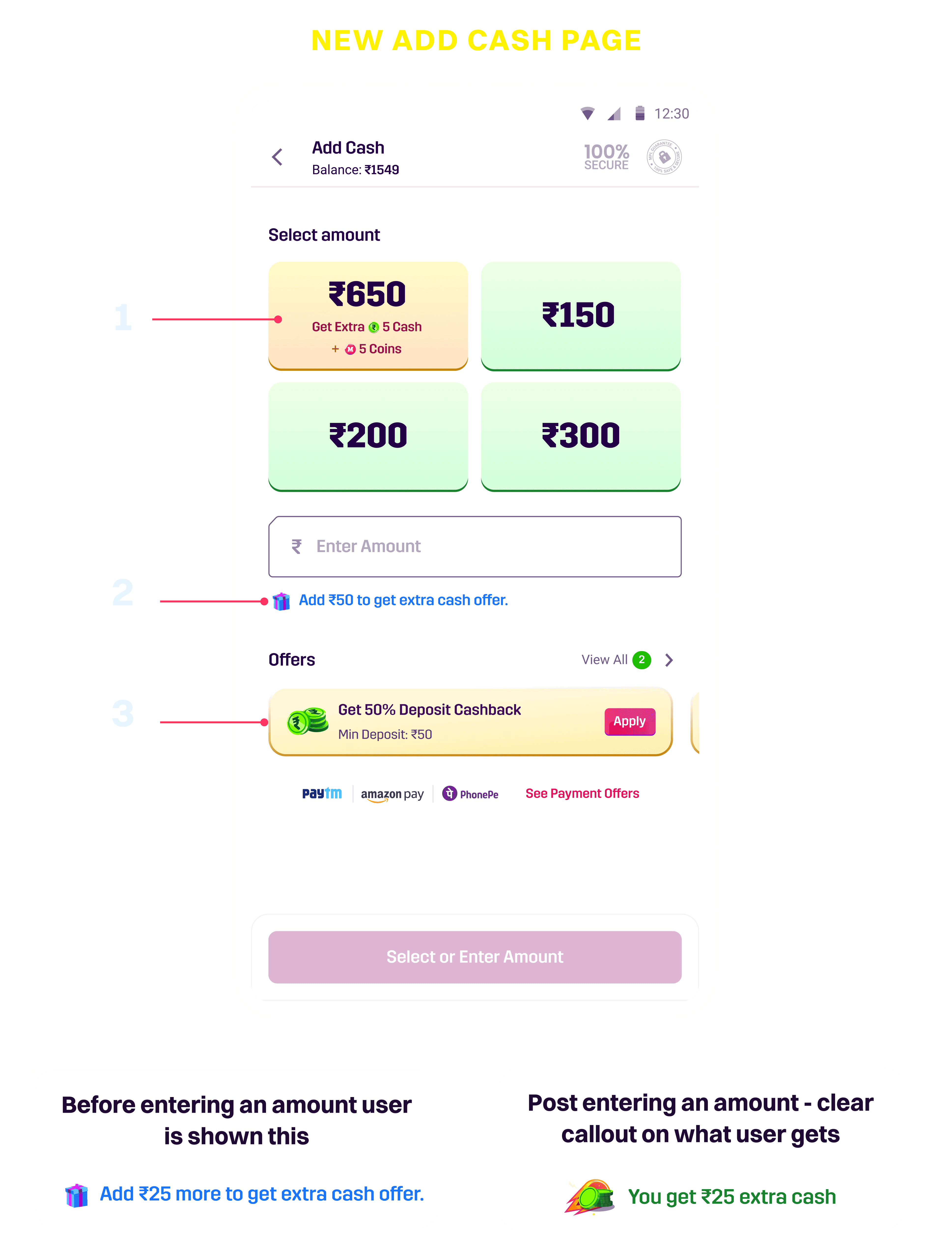
2) Added clear callout below input field prompting action and information
1) Made offer tiles stand out by keeping regular ones green and using a different color for offers.
3) Added offers upfront for the user to select rather than going in a different section

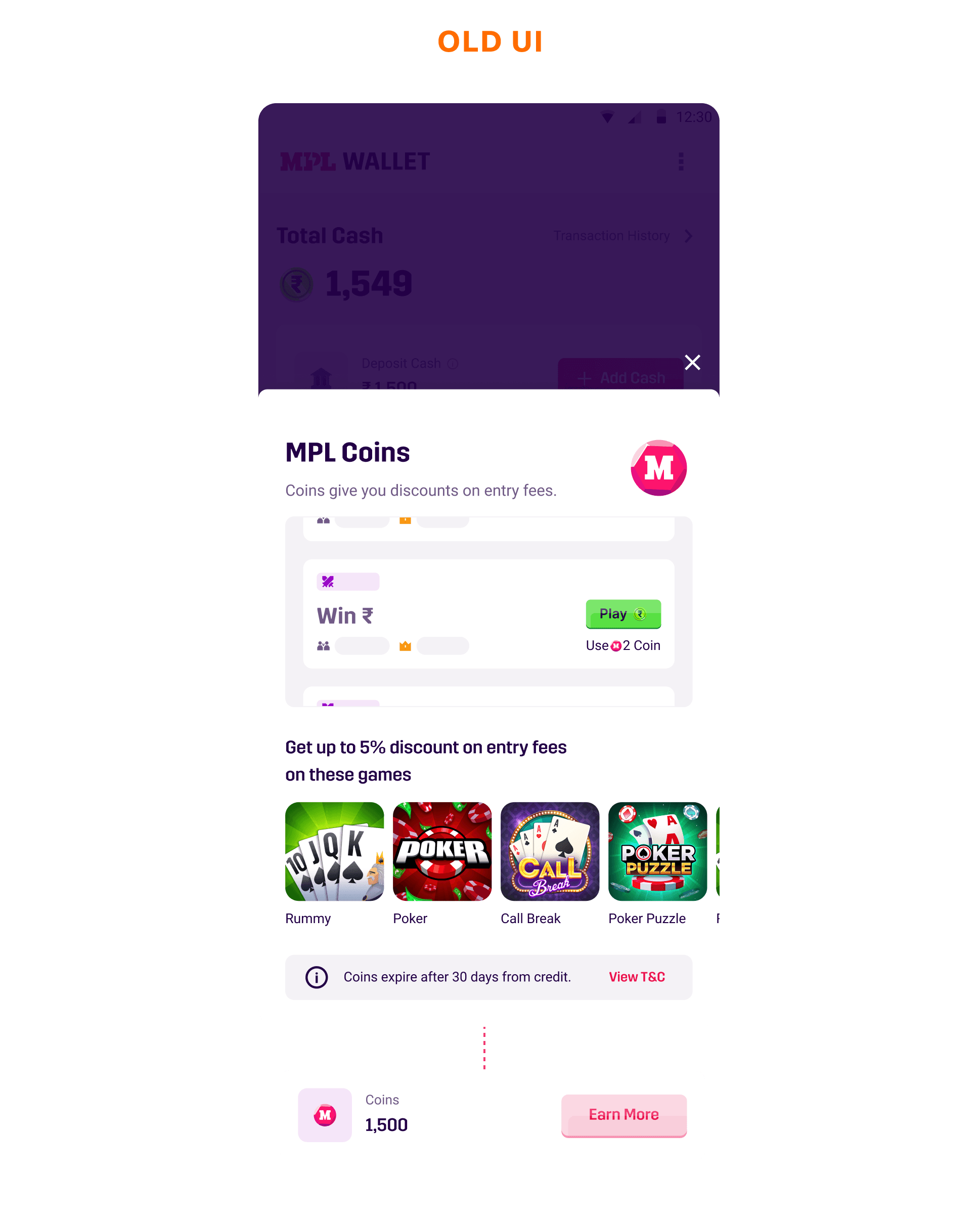
1) MPL Coins are a reward-based currency that users can use to get discounts before joining any game. However, for new users, there’s currently no clear explanation of how this works.
1) MPL Coins are a reward-based currency that users can use to get discounts before joining any game. However, for new users, there’s currently no clear explanation of how this works.
Earlier the CTA highlighted earn more which did not make sense for a new user as they don’t know the value of coins

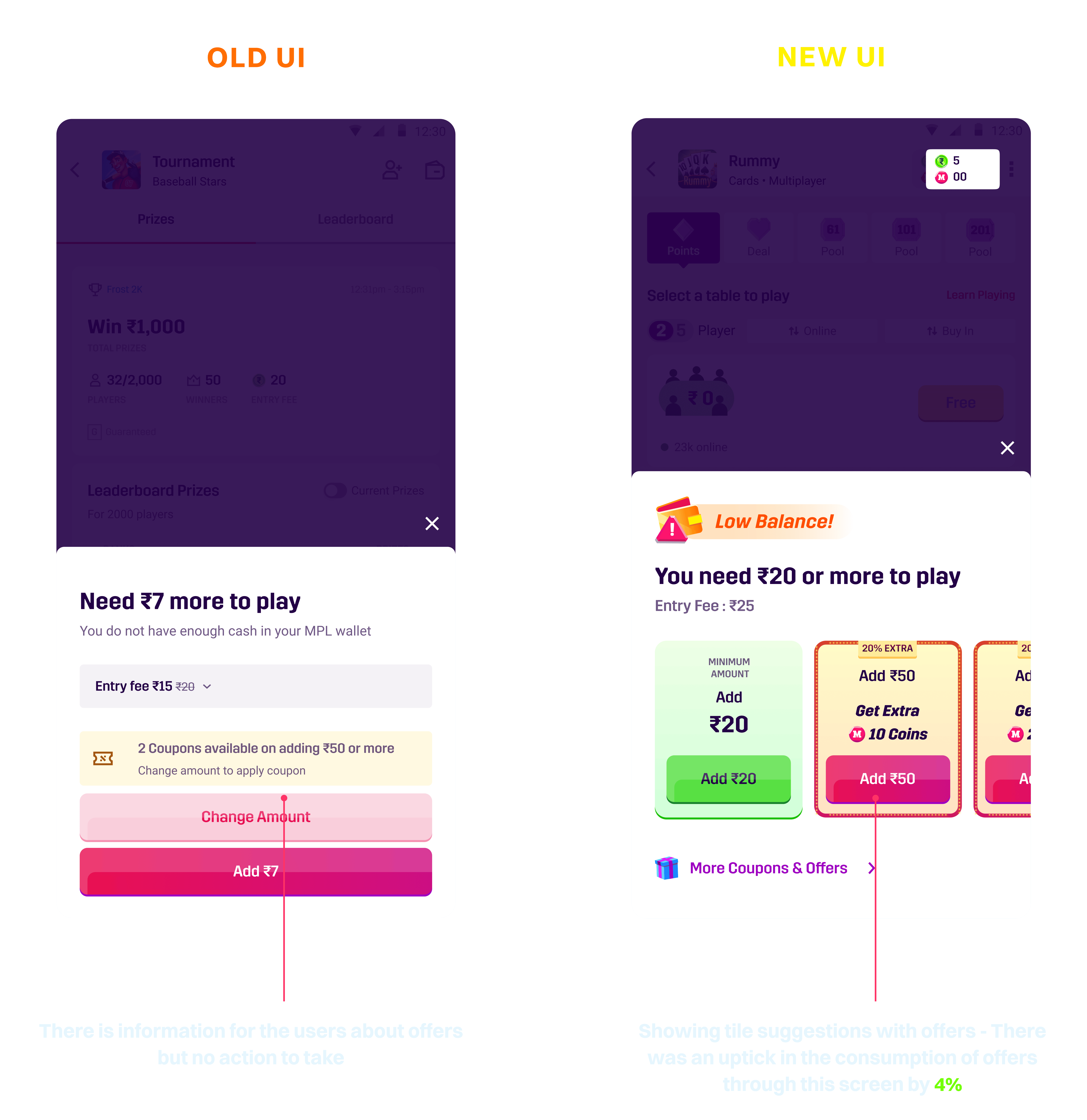
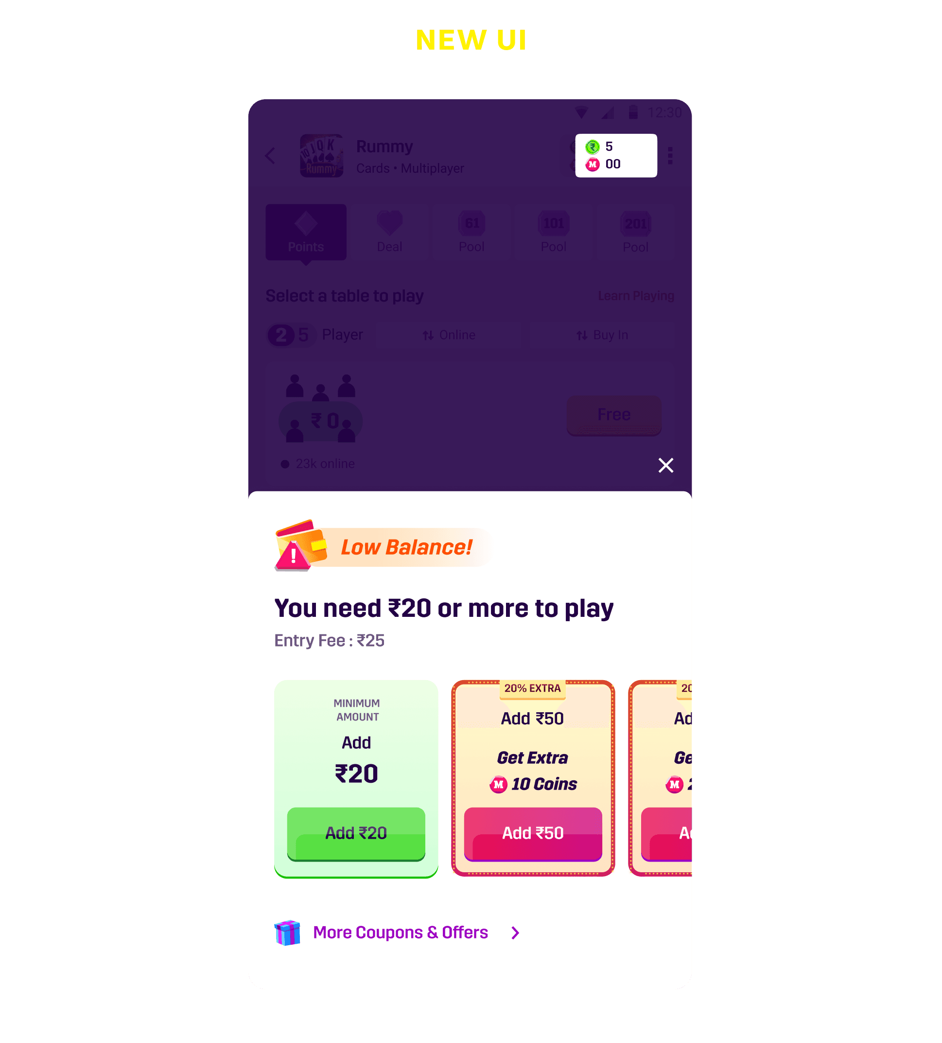
2) Second issue I noticed is that when a user with insufficient balance tries to join a game, the bottom sheet shows the minimum amount to add, but from a business perspective, we can instead highlight a better amount along with relevant offers.
2) Second issue I noticed is that when a user with insufficient balance tries to join a game, the bottom sheet shows the minimum amount to add, but from a business perspective, we can instead highlight a better amount along with relevant offers.
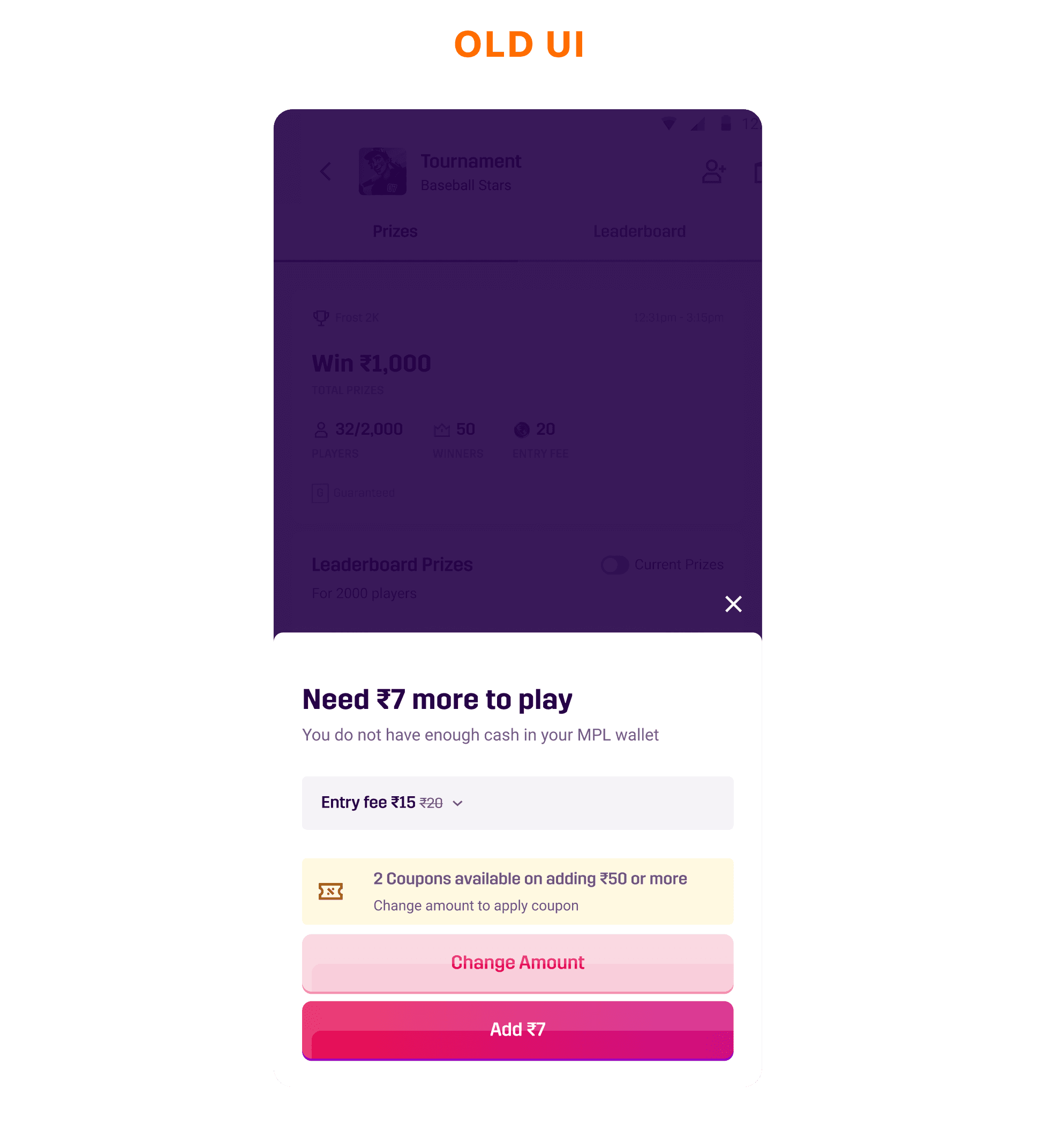
1) Wallet Page: The wallet screen feels cluttered, and users don’t have a clear sense of what they’re supposed to explore or engage with.
1) Wallet Page: The wallet screen feels cluttered, and users don’t have a clear sense of what they’re supposed to explore or engage with.
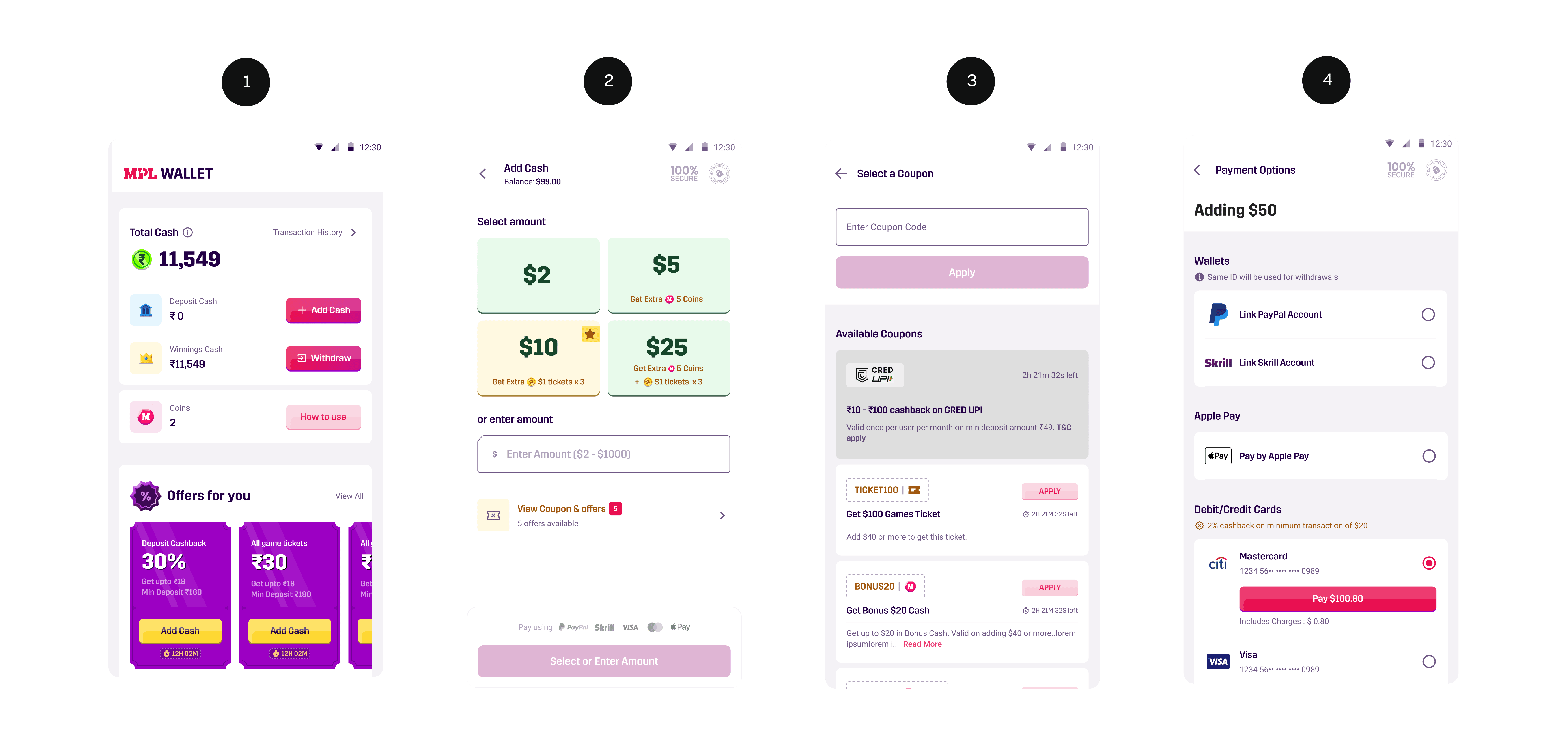
2) Add Cash Page: The tiles lack the vibrant color tones typically associated with offers, making them easy to overlook.
2) Add Cash Page: The tiles lack the vibrant color tones typically associated with offers, making them easy to overlook.
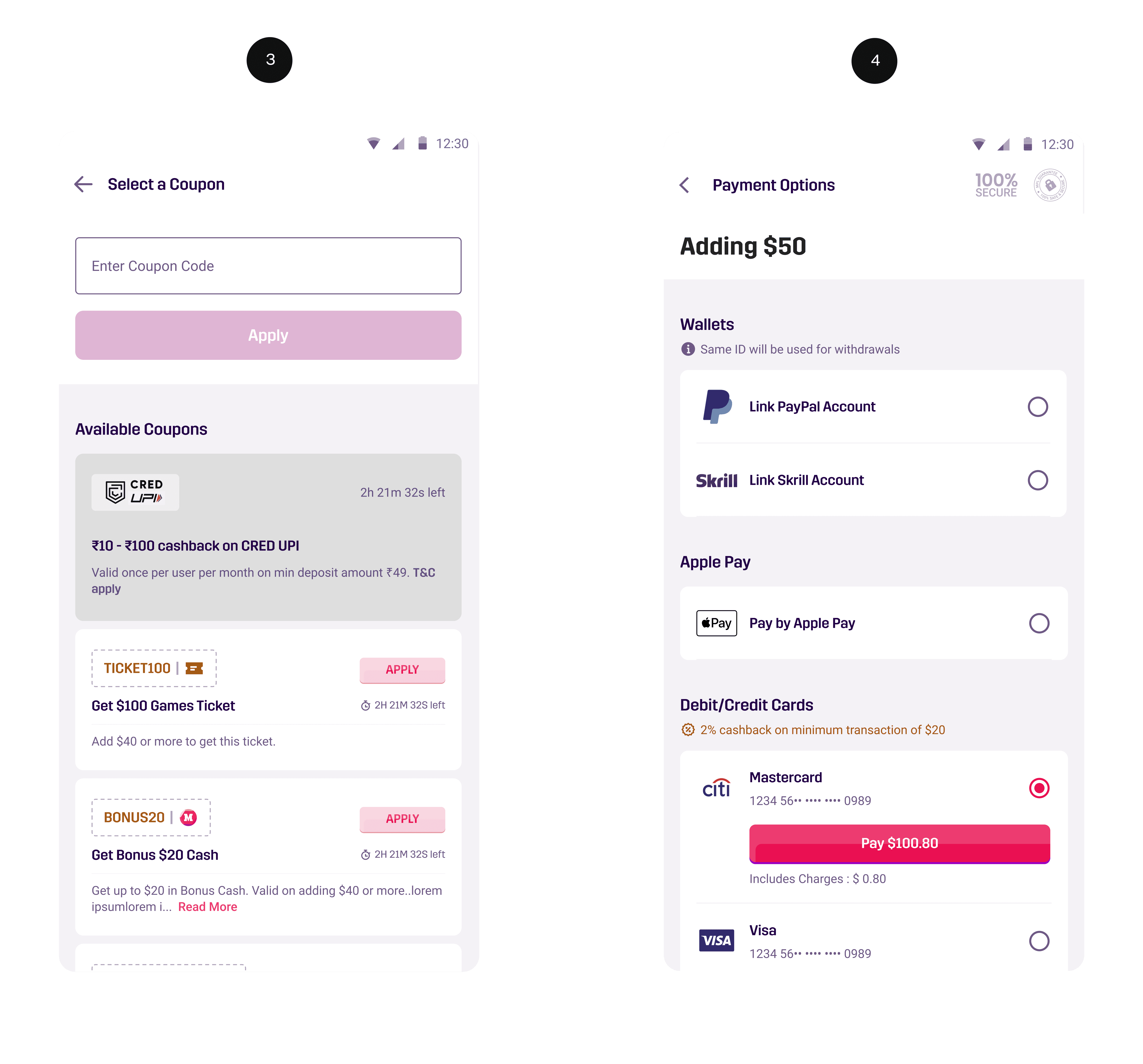
3) Coupon Section: This section also feels dull - it doesn’t visually communicate the excitement or value of an offer.
4) Payment options page: No flaws as such but just wanted to match the ui with the enhancements made for other screens
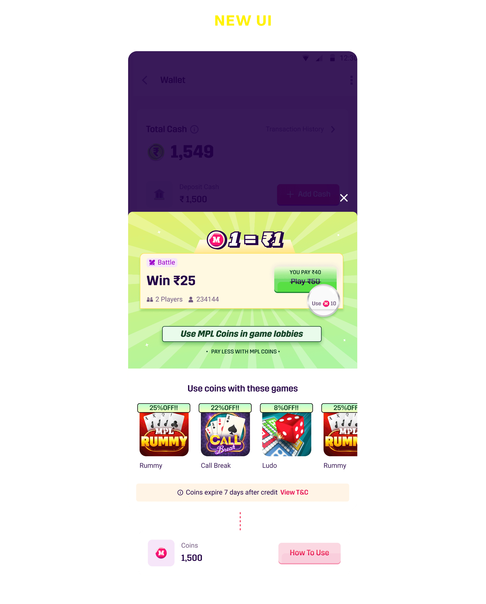

The new CTA is more new user friendly and shows the exact value of a coin comparing it with real currency
There is information for the users about offers but no action to take so while redesigning this screen we have an opportunity to increase average deposit value for a user
Showing tile suggestions with offers directly with CTA's - There was an uptick in the consumption of offers through this screen by 4%
3) Coupon Section: This section also feels dull - it doesn’t visually communicate the excitement or value of an offer.
4) Payment options page: No flaws as such but just wanted to match the ui with the enhancements made for other screens
3) Coupon Section: This section also feels dull - it doesn’t visually communicate the excitement or value of an offer.
4) Payment options page: No flaws as such but just wanted to match the ui with the enhancements made for other screens

beneg
3) Improved UI with a more spicy look
4) Added payments offers and gift on options which have active cashback
1) Primary focus on this screen for a user should be to add money
2) Cleaned up the tiles with softer gradients and added offers upfront


1) Primary focus on this screen for a user should be to add money
2) Cleaned up the tiles with softer gradients and added offers upfront
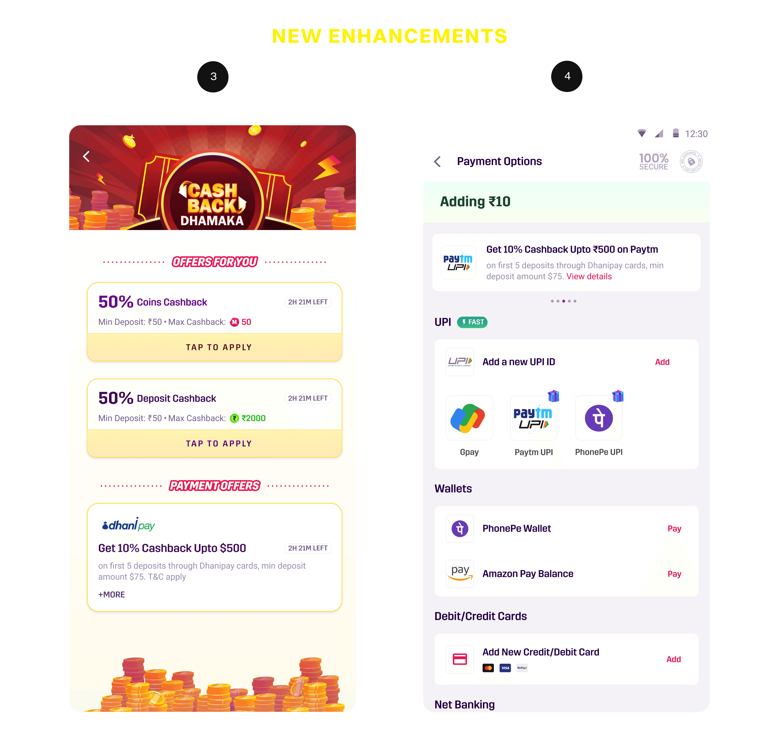
3) Improved UI with a more spicy look
4) Added payments offers and gift on options which have active cashback


1) Clear communication of offers, including both the deposit amount and the reward value, along with a simple one-tap flow to the payment mode after selecting an offer.
1) Clear communication of offers, including both the deposit amount and the reward value, along with a simple one-tap flow to the payment mode after selecting an offer.
2) Users tend to respond better to strong UI elements - they attract attention and build more trust compared to generic billboard banners. (Fun fact: One of the users I spoke to mentioned that those banner-style offer ads feel untrustworthy)
2) Users tend to respond better to strong UI elements - they attract attention and build more trust compared to generic billboard banners. (Fun fact: One of the users I spoke to mentioned that those banner-style offer ads feel untrustworthy)
3) Since I was a new user myself, it helped me better empathize with the first-time experience and identify the gaps across screens, which we addressed through our enhancements.
3) Since I was a new user myself, it helped me better empathize with the first-time experience and identify the gaps across screens, which we addressed through our enhancements.
beneg

Check out other work
Check out other work